
Branding · Small business · Food marketing
AI Slop Signs: When Your Menu Becomes the Joke
AI slop signs can turn your menu into a social media punchline. Hire a graphic artist, show your actual food, and give customers a reason to trust what you sell.
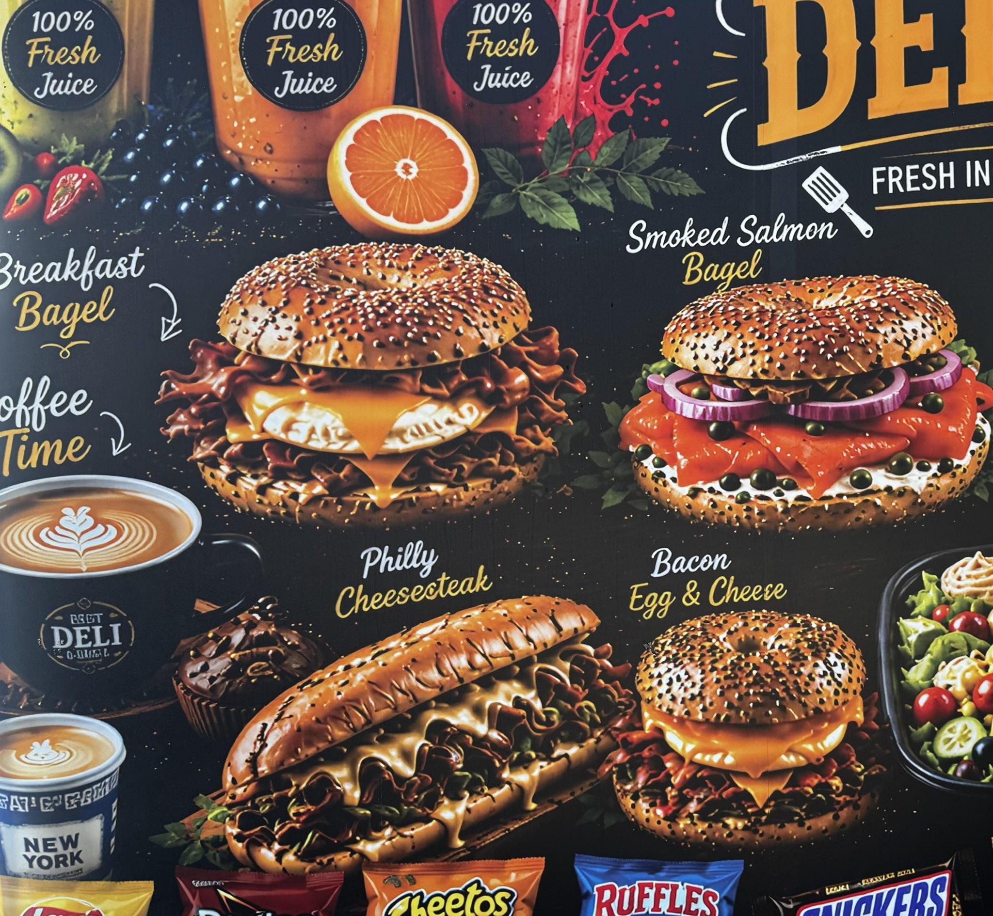
AI slop signs are business signs and menus filled with low-quality AI-generated images: glossy food that looks convincing at a glance, until you notice the worm-like rice, plastic cheese or shrimp doughnuts. For a food business, those details can turn an invitation to eat into a reason to keep walking.
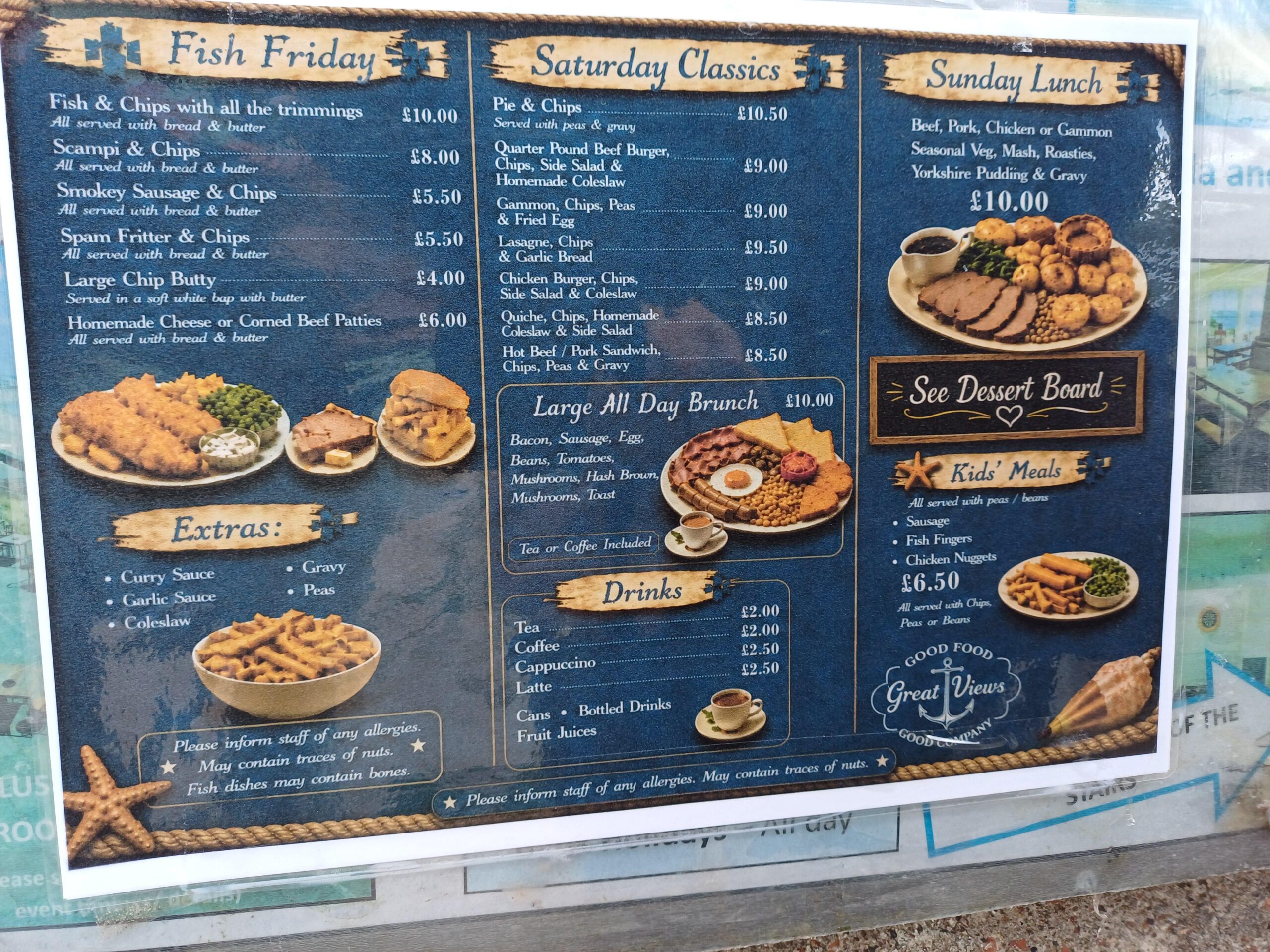
I recently visited a local tourist attraction with lots of commercial restaurants, and I was shocked by how many were using AI-generated food images on their sidewalk signs. These were the pictures meant to tempt people through the door. Instead, they made me question why the restaurants were not showing the food they actually served.
You have a business to run. You need a sign, a menu, a promotional banner or a few images for your window. An AI tool promises to do it in seconds. I understand the temptation.
But the thing you put outside your business becomes part of its first impression. Before anyone tastes your food, asks about your services or meets the person behind the counter, they see the sign. If it looks careless, confusing or obviously artificial, you have given them a reason to hesitate.
My advice: hire a graphic artist. And if you sell food, use real photographs of the food you actually serve—even if those photographs are not great.
Why AI slop signs become social media punchlines
There are whole Reddit communities devoted to calling out AI slop, and business signs and food menus have become part of that conversation. A restaurant menu appears in this r/aislop discussion. The criticism also spills into local communities: a Toronto discussion about restaurant signage includes a preference for imperfect phone pictures of real food over generated imagery.
People are not just walking past these pictures. They are photographing them, laughing at them and posting them on social media to shame the businesses using them. The Reddit threads linked above show how quickly a food sign can become a public roast. You wanted word of mouth. You got a comment section debating whether your rice needs an exterminator.
There is a difference between “everyone is talking about our restaurant” and “everyone is sharing our sandwich because the bread looks like a reptile.” One might bring in lunch orders. The other gives strangers something to laugh at over theirs. Going viral is not much of a marketing win when the joke is your menu.
Those threads are anecdotes, not a customer survey. They do, however, show that people notice. Some interpret artificial food images as a lack of effort. Some say the pictures put them off visiting. That is a terrible conversation to start when you are trying to persuade someone to give your business a chance.
For some customers, an obviously AI-generated food image is an automatic NO. They do not trust it, and they are not going to walk in and order just to find out whether the real meal is better than the sign. The image has already lost them. The reactions in those Reddit discussions make that clear: some people say they would rather avoid the business altogether.
As the controversy around AI grows, business owners should expect customers to look more closely at generated images. The discussions linked above show people comparing notes, spotting odd details and calling out pictures that might once have passed a quick glance. Do not assume your customers will miss the cucumber gears.
For customers who reject AI-generated marketing, the response is a vote with their wallets. They can walk past your sign, skip your restaurant and spend their money somewhere that shows the real thing. Some commenters describe exactly that reaction. You do not have to lose every customer for a supposed money-saving shortcut to become an expensive decision. The internet gets a laugh; the business down the street gets the lunch order.
Food marketing depends on trust. People want to know what they are paying for, and a picture of an invented meal gives them no reliable answer. If you will not show your actual food, you invite the question: why not? Your sign should reassure a hungry customer, not make them suspicious before they have even seen the menu.
The lesson for business owners is simple: do not hand the internet a ready-made punchline. Your food may be wonderful, but the customer scrolling past a screenshot cannot taste it. All they have is the picture—and the jokes underneath it.
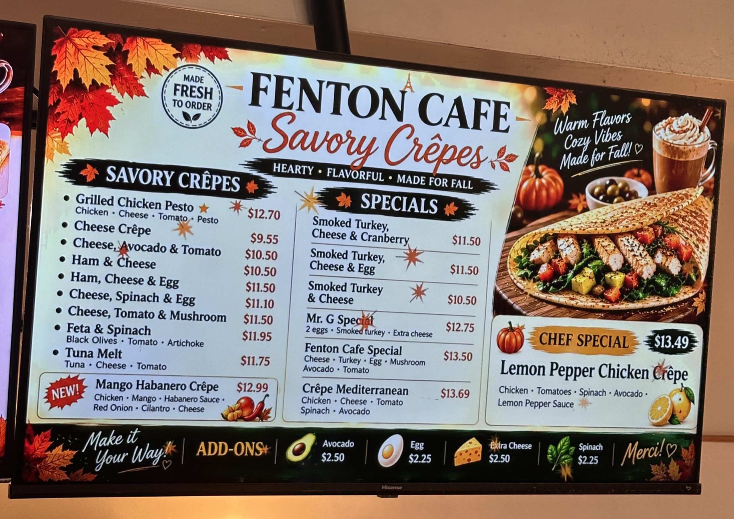
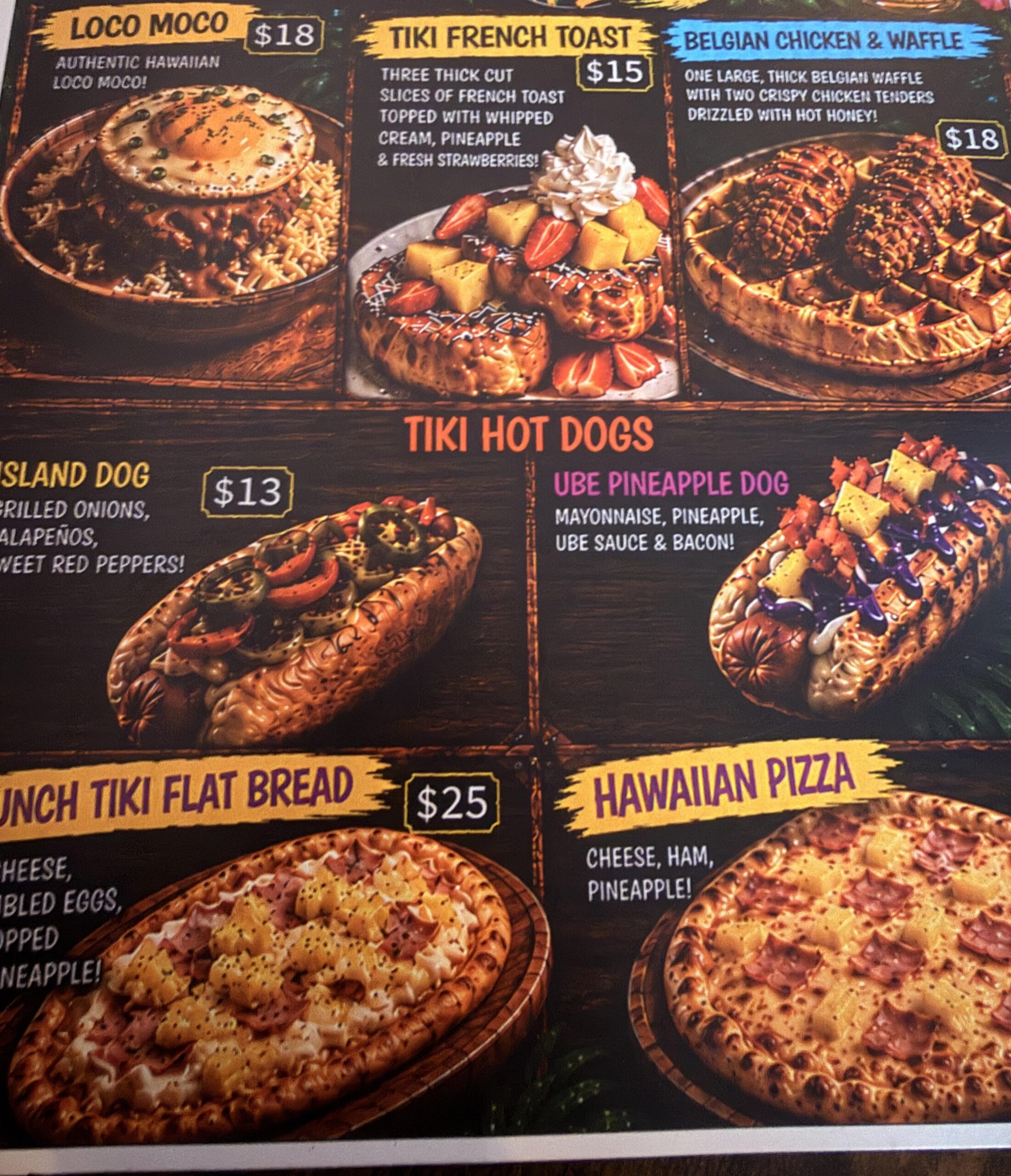
Why AI-generated food signs need professional design
A graphic artist thinks about what a customer needs to understand, how far away they will be, and what they should notice first. Your name, your offer and the next step need a clear order. Type must be readable. Colours need contrast. Your logo needs to survive being enlarged. The artwork has to work at the size you will actually print.
A generated picture does not automatically solve any of those problems. It can introduce distracting details, awkward lettering, inconsistent styling or objects that make less sense the longer you look at them. Even when the image looks convincing, the sign still needs a person who understands design and print production.
A simple, properly designed sign can do far more for your business than a crowded fantasy scene. Customers should be able to understand what you sell without decoding the artwork.
“Free” stops being free when you have to fix it
Count the whole job: time spent writing prompts, generating variations, correcting details, rearranging text, finding a usable file and checking it with the printer. Then consider what happens if you notice the problem after paying for a banner, window graphic or stack of menus.
Hiring a graphic artist from the beginning can save you a lot of time and money. It gives the work a clear brief, a production process and someone responsible for the finished design. There is no universal price comparison, but avoiding repeated revisions and a reprint is a very practical kind of saving.
People say you get what you pay for. With AI slop representing your product and your business, you can actually go negative in the numbers. The sign may have cost almost nothing, but if it makes customers laugh, distrust the food or keep walking, you are losing the sales from people who never make it through your door.
You know your worth. You need to know other professionals’ worth too.
Every business owner hears some version of the same thing: anyone can flip a burger, anyone can cook a pizza, anyone can do the job. You know that is not true. You know the training, judgement, repetition and care behind your work—and the value of your business.
Graphic designers know the worth of their work too. They bring years of education and experience to the table: typography, layout, colour, hierarchy, production and visual problem-solving. That expertise helps your business look sharp, clear and trustworthy before a customer ever places an order.
Tell the artist your budget. Ask what a focused project would cost: one strong sign, a readable menu and reusable artwork may be enough. Confirm the deliverables, revision allowance and printer requirements before the job starts. If you want original artwork and real photography, say so explicitly; hiring someone does not automatically mean they will avoid generated images.
For menus and signage, work with a professional who will help you with the design so you do not repeat these disasters. Get another experienced pair of eyes on the layout, lettering, food images and print proof before your shrimp doughnuts become a six-foot sidewalk attraction.
I personally use Howard at Printing Discounters for his personal attention to detail. That kind of care matters when your menu or sign is going to represent your business in public. Talk through the design, ask questions and check the finished proof together. A little professional attention before printing beats paying to put the same mistake on every table.
Your food picture makes a promise about the meal: the ingredients, portion, texture and presentation. AI has not visited your kitchen. It does not know how you cook, what you plate or what leaves your serving window.
A beautiful invented pizza is still an invented pizza. It cannot show the customer what yours looks like. The more impressive the fiction, the greater the potential gap between the picture and the plate.
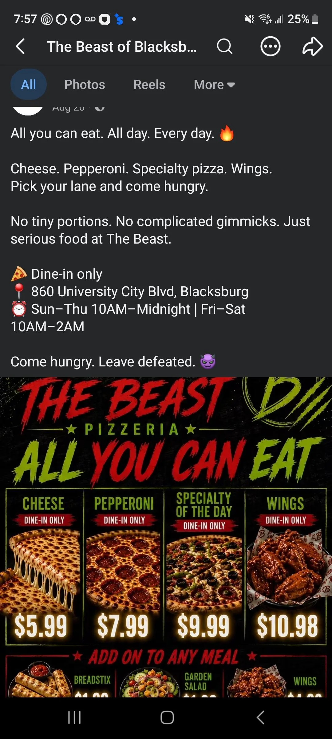
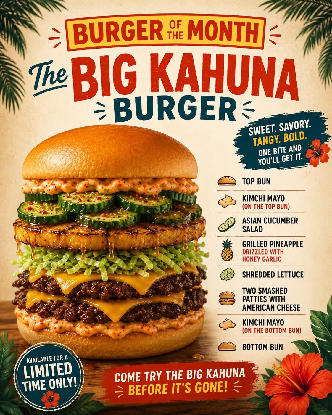
Is that lunch, or a prop from a low-budget horror film?
Food is especially unforgiving when the texture looks wrong. Waxy cheese, plastic-looking buns, strangely glossy meat and toppings that seem to melt into one another can turn an otherwise familiar meal into something you would rather not eat. Instead of imagining the first bite, you start wondering what you are looking at.
Think about what makes real food appetising: the uneven crust on a pizza, the crisp edges of fried chicken, the crumb of fresh bread, the way melted cheese actually settles. Generated food can replace those details with smeared surfaces, repetitive patterns or a shine that looks more like varnish than something edible. A picture can be sharp and colourful and still make the food look deeply unappetising.
If the burger looks like a plastic prop or the pizza looks waxy, the sign is working against you. The customer should be thinking “that looks delicious,” not trying to work out why the bread, sauce and filling seem to have the same synthetic texture.
Before you print, look closely at every food image. Do the ingredients have distinct, believable textures? Does the bread look like bread? Does the meat look cooked rather than lacquered? Would you actually want to eat what is pictured? If the answer is no, a larger print will only make the problem more visible.
This is another reason to photograph the real meal. A slightly imperfect picture of genuinely crisp chicken or a freshly baked pizza gives customers something recognisable and appetising. Invented gloss cannot replace the texture of actual food.
“That looks amazing!” Famous last words before the printer.
If you are a business owner rather than a graphic designer, I understand why that first result can look fantastic. It is much fancier than anything you could have put together yourself: dramatic lighting, rich colours, elaborate backgrounds and food stacked like it is auditioning for a billboard. It feels like you have just acquired an entire design department for the price of a prompt. But fancy is not the same as good. The overall effect can be impressive while the details are atrocious.
The AI food images in these signs are VERY obvious once you recognise the recurring patterns. There is that same lacquered shine, the unnaturally tidy layers, the suspiciously repetitive crumbs, the patterned ingredients and the bread that seems to have been upholstered. Different businesses, different menus, same imaginary kitchen. Not every generated image is equally easy to spot, but these familiar visual habits make low-quality AI food advertising remarkably recognisable.
You may be looking at the beautiful lighting. Your customer is looking at the cucumber gears and wondering whether the chef moonlights as a watchmaker. That gap is why a professional designer's judgement matters: they look beyond the initial wow factor and check whether the finished image actually works.
You ask AI to generate an image of your food. It comes back bright, glossy and beautifully lit, and your first reaction is, “That looks amazing!” You are pleased with the result, so you download it and send it off to print. But did you actually check the details?
Look closer. That rice might look more like a pile of worms than separate grains. The cheese might merge into the bun. The crispy coating might have a strange, repeated pattern that no real piece of chicken has. The overall composition caught your eye, but the details are what your customers will be staring at while they decide whether to order.
If the rice looks like worms, the beautiful lighting is not going to save it. That is a nature documentary with a side of soy sauce. Once someone notices that resemblance, it can be hard to see anything else—and it is hardly going to make them hungry. Zoom in, inspect every ingredient and review the artwork at its intended print size. Better still, use a photograph of the food you actually make.
Imperfect and honest beats polished and imaginary
Natural light is always best. Take the dish outside and put it on a table. Do not worry about the background—just focus on the dish. Customers want to see the food, not a photo studio.
I am not suggesting you deliberately make your food look unappealing. I am saying that an imperfect real photograph gives you something truthful to improve. You can reshoot it. You can learn better lighting. You can hire a photographer when the budget allows.
Use a clean phone lens, soft window light and a tidy background. Photograph a normal serving, not an exaggerated version made only for the camera. Try a few angles. Choose the sharpest image and check that the colours look like the dish in front of you.
- Photograph what you actually sell. Keep the ingredients, serving size and presentation representative.
- Edit for clarity. Cropping and modest exposure or white-balance adjustments can help. Do not invent toppings, enlarge portions or replace the meal.
- Make the information readable. Keep names, descriptions and prices as properly typeset text rather than baking them into a generated image.
- If a picture is not ready, leave it out. A clean, well-written menu can work without photographs while you arrange a reshoot.
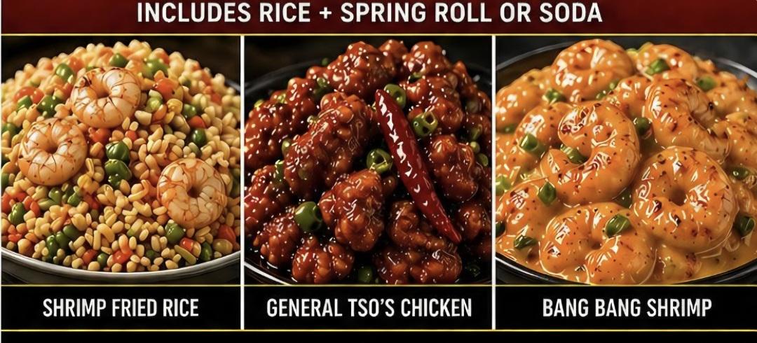
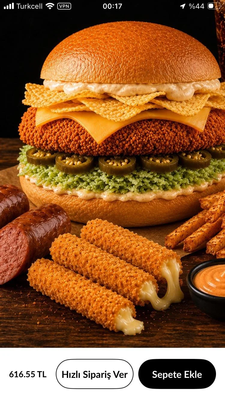
Your real food is the interesting part
Whether you run a restaurant, cafe, bakery, takeaway, food truck or catering business, your signs and menus should help people understand what you offer quickly. Your business name, the food you sell and a few clear details deserve the space. You do not need a glossy imaginary world around them.
A photograph of your actual products, a thoughtful layout and readable lettering can tell a much stronger story. The things you make and the care you put into them are worth showing. Give those things the attention instead of covering them with generic imagery.
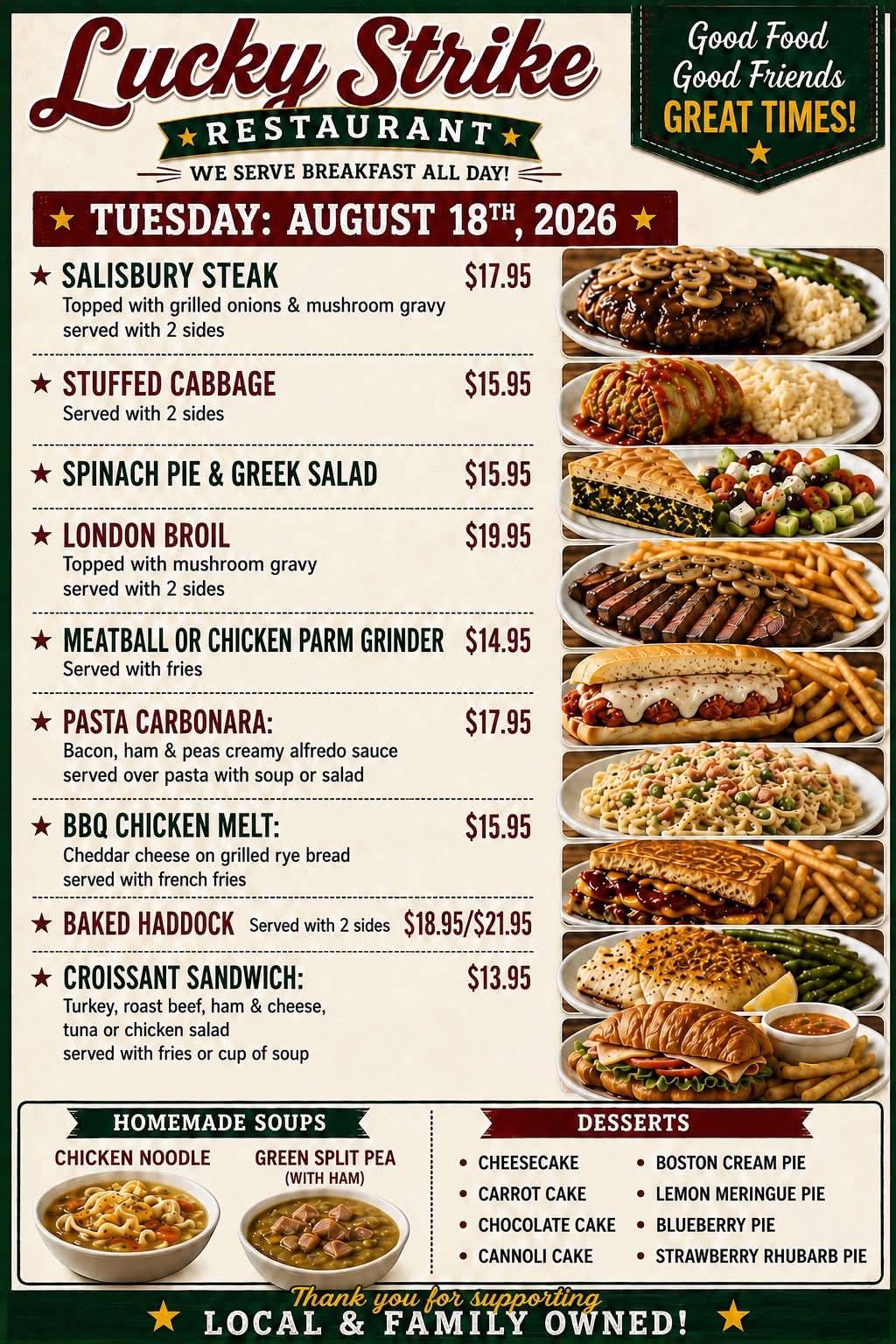
A quick disclaimer: yes, I use AI.
I talk about AI a lot, and I use it in my own work. It is a useful tool for coding and sometimes for mapping out an initial design. I then fine-tune that design manually, use real images and apply my own experience to make the finished work right for the business.
This is how I believe AI should be used: as a tool guided by expertise. It does not replace expert experience, design judgement or responsibility for what you publish. Getting a starting point from AI is one thing. Sending its first attempt straight to the printer and hoping nobody notices the shrimp doughnuts is quite another.
How to avoid AI slop signs: real photos and expert design
AI can help organise ideas or turn your rough notes into a brief. The final public-facing work still needs informed human judgement. For signage, that means a graphic artist who can make the message clear and prepare it properly. For food, it means real photographs.
Hire the artist. Photograph the actual meal. Check the proof before it goes to print. Give people a lunch special, not fresh material for Reddit. Your time is valuable, reprints are frustrating, and customer trust deserves more care than a quick generated picture.
Banba Creations
Make your business look like a business worth choosing.
Need help bringing your website, branding and marketing into focus? Let's talk about what your customers see and what needs to work better.
Talk to Banba Creations